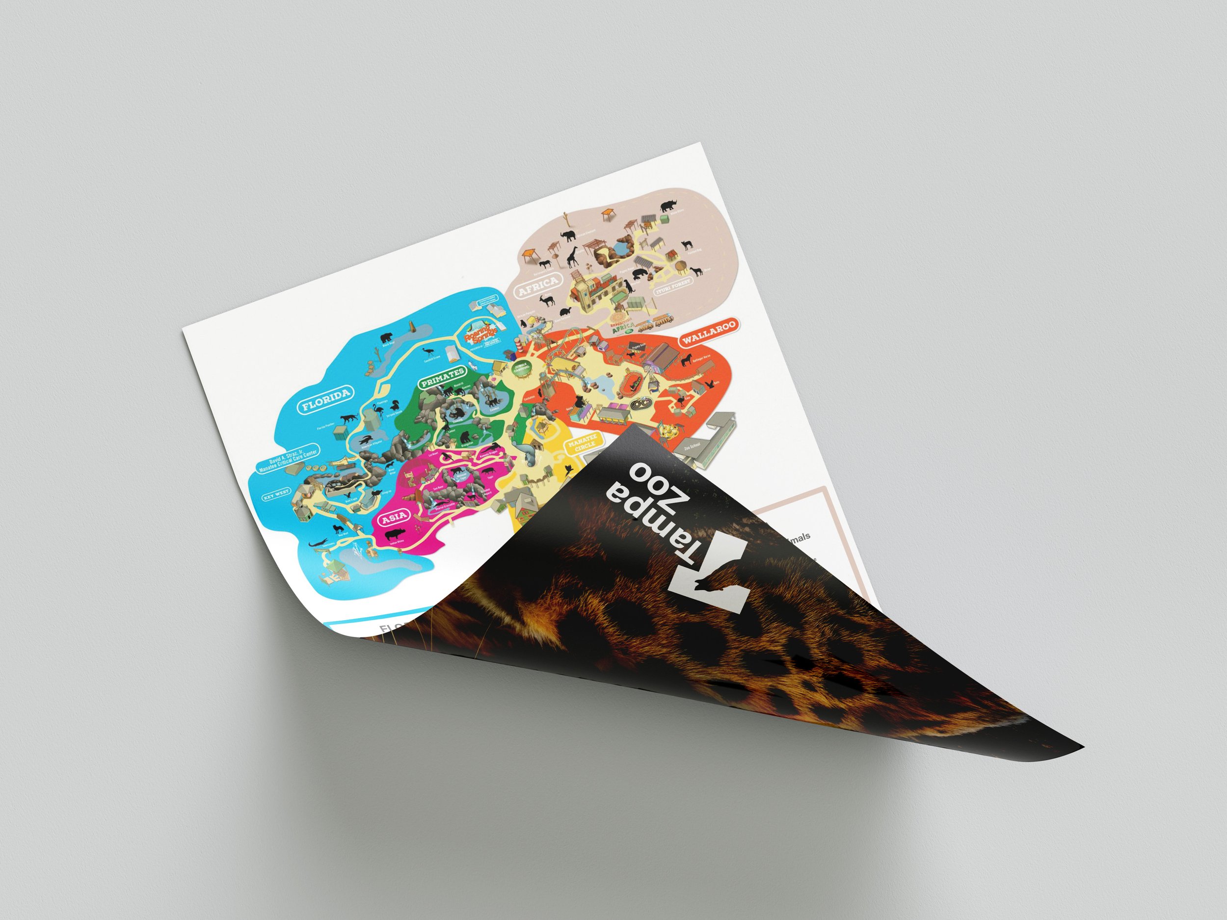
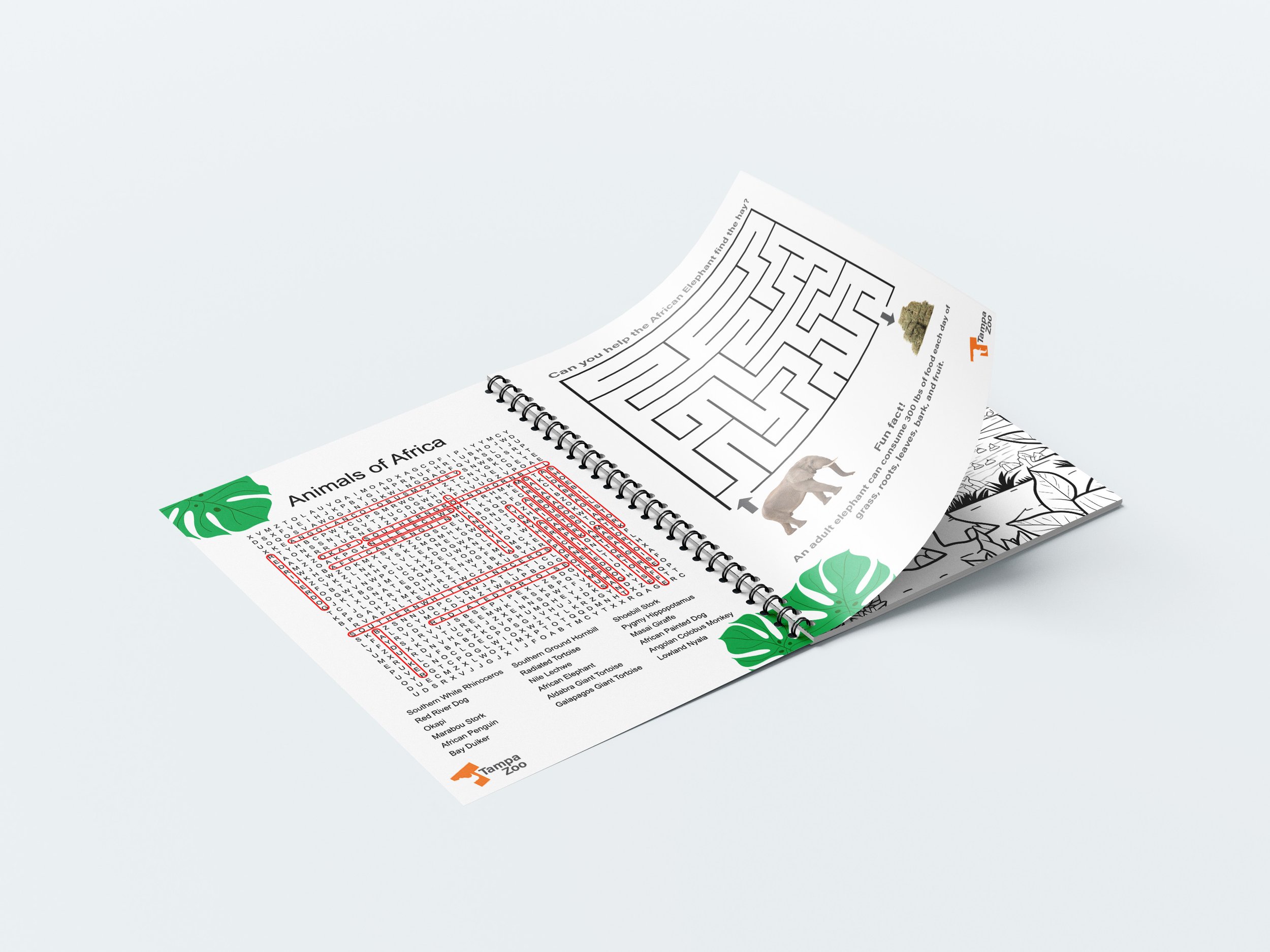
Tampa Zoo Rebrand
In 2017, Tampa Zoo underwent a rebranding process, which included updating its logo. Feedback revealed that the original 1980s earth-tone design didn’t stand out enough on outdoor signage, prompting a shift to bright blue, green, and yellow hues inspired by Florida’s coastal environment.
While this was an improvement, there was still an opportunity to refine the brand further. This project takes inspiration from Tampa Zoo’s updated color palette but reimagines the logo entirely, creating a more modern and minimalistic design. The goal was to develop a bold, eye-catching identity that enhances visibility, captures the excitement of visiting Tampa Zoo, and stands the test of time.
Brand Identity
Advertising
Motion
Signage
Social Media


