Typography Exploration Book
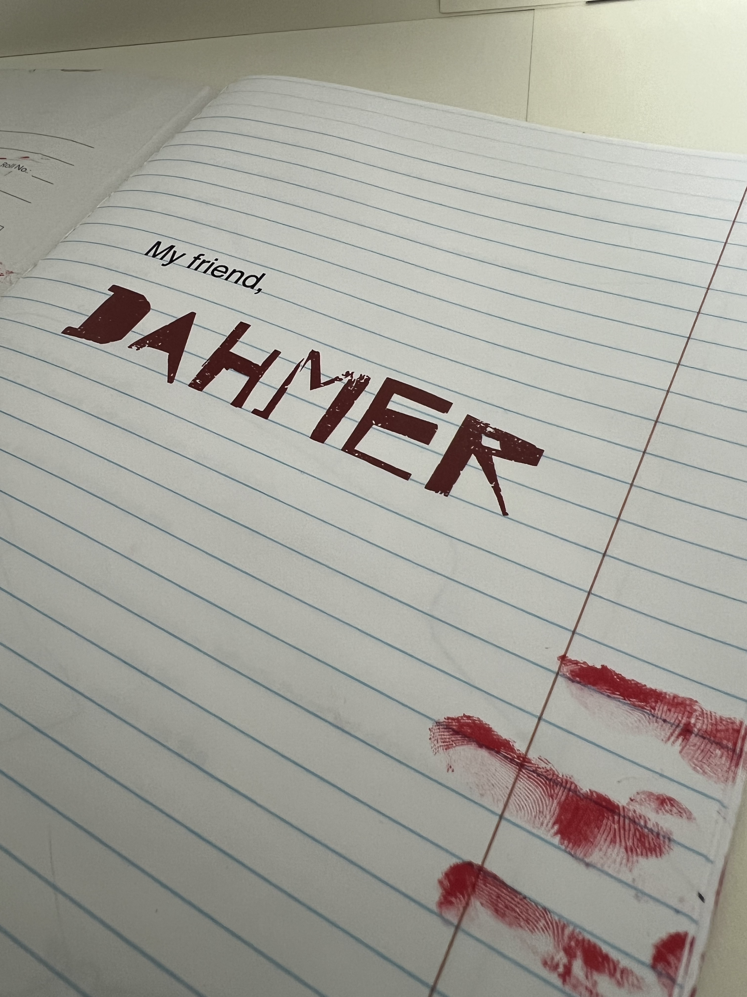
Inspired by My Friend Dahmer, directed by Marc Meyers, this project consists of a typography-based book and a short motion piece. The goal was to carefully place, manipulate, and integrate words from a key scene—both in print and motion—to capture the film’s unsettling energy.
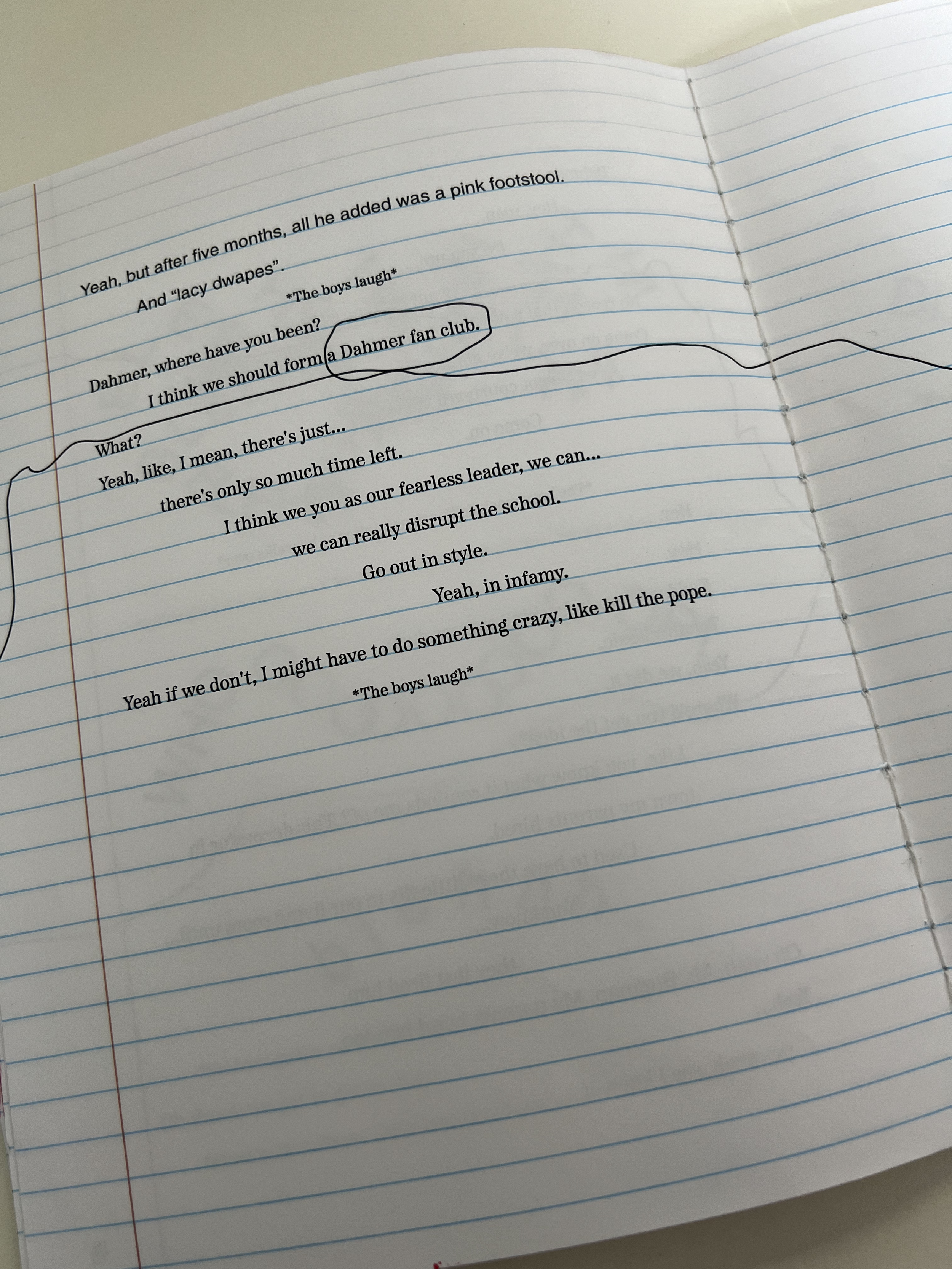
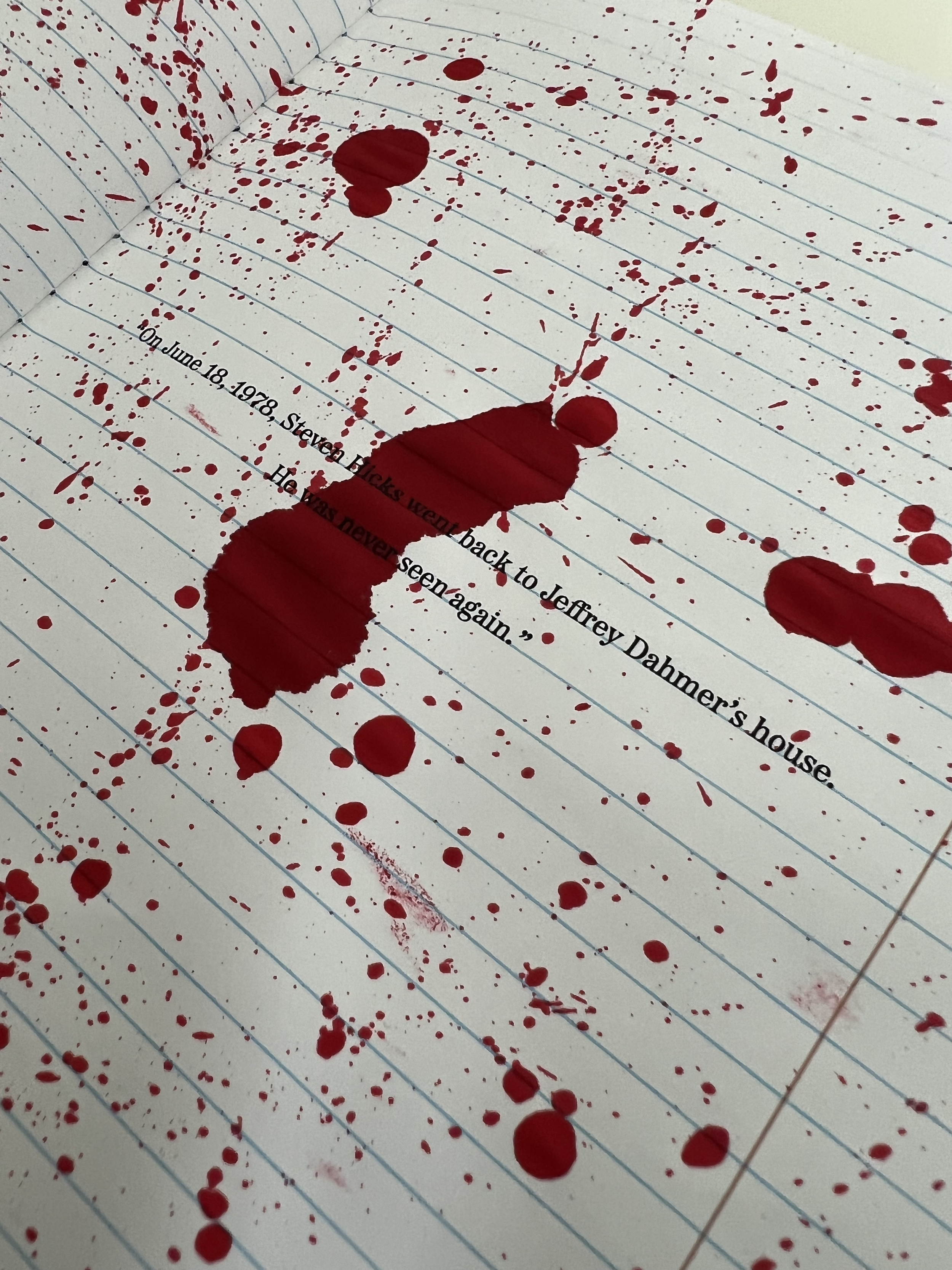
Set in the 1970s, the movie follows Jeffrey Dahmer during his high school years, before his first murder. To reflect this, a composition notebook was deconstructed, distressed to look like a beat-up notebook Dahmer might have used, and then hand-sewn back together to reinforce its raw, personal nature. The typeface Helvetica was deliberately chosen—widely used in society yet often overlooked, mirroring how Dahmer, an outcast, went unnoticed by his peers. Helvetica appears only in the lines he speaks, reinforcing his isolation within the design.
Typography
Motion